IMPACT
Academic Branding Project
The Brief
Research previous explorers/expeditions, select a target audience and create a piece of communication design that captures the content in a new and exciting way.
Researching Explorers/Expeditions
I wanted to go down the unconventional explorers route, focusing on those whose journeys weren’t tied to traditional geographical discovery. These figures explored physical extremes and unorthodox feats. Among them, Frank “Cannonball” Richards stood out — a vaudeville performer whose most famous act involved taking a direct cannonball hit to the stomach, an absurd yet fascinating demonstration of the limits of the human body.

Frank ‘Cannonball’ Richards (1887 – 1969)
Frank Anson Richards, also known as Frank "Cannonball" Richards, was a carnival and vaudeville performer whose act involved taking heavy blows to his abdomen. Richards began by letting people punch him in the gut.
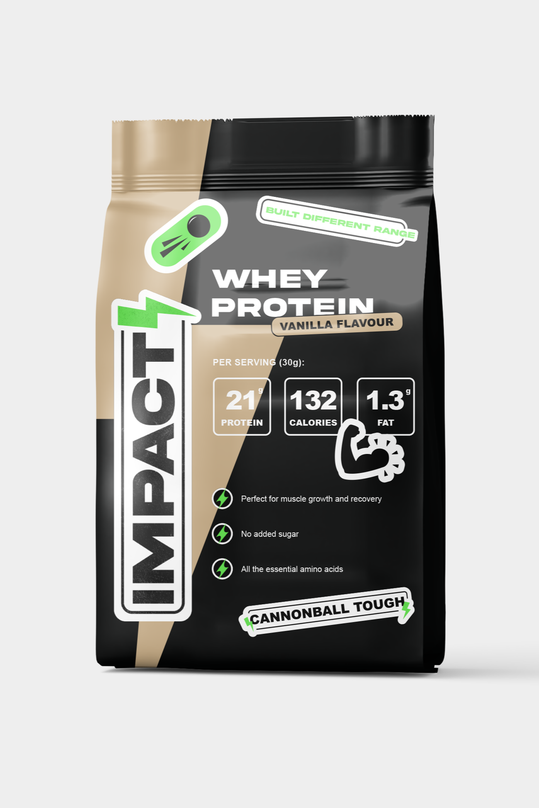
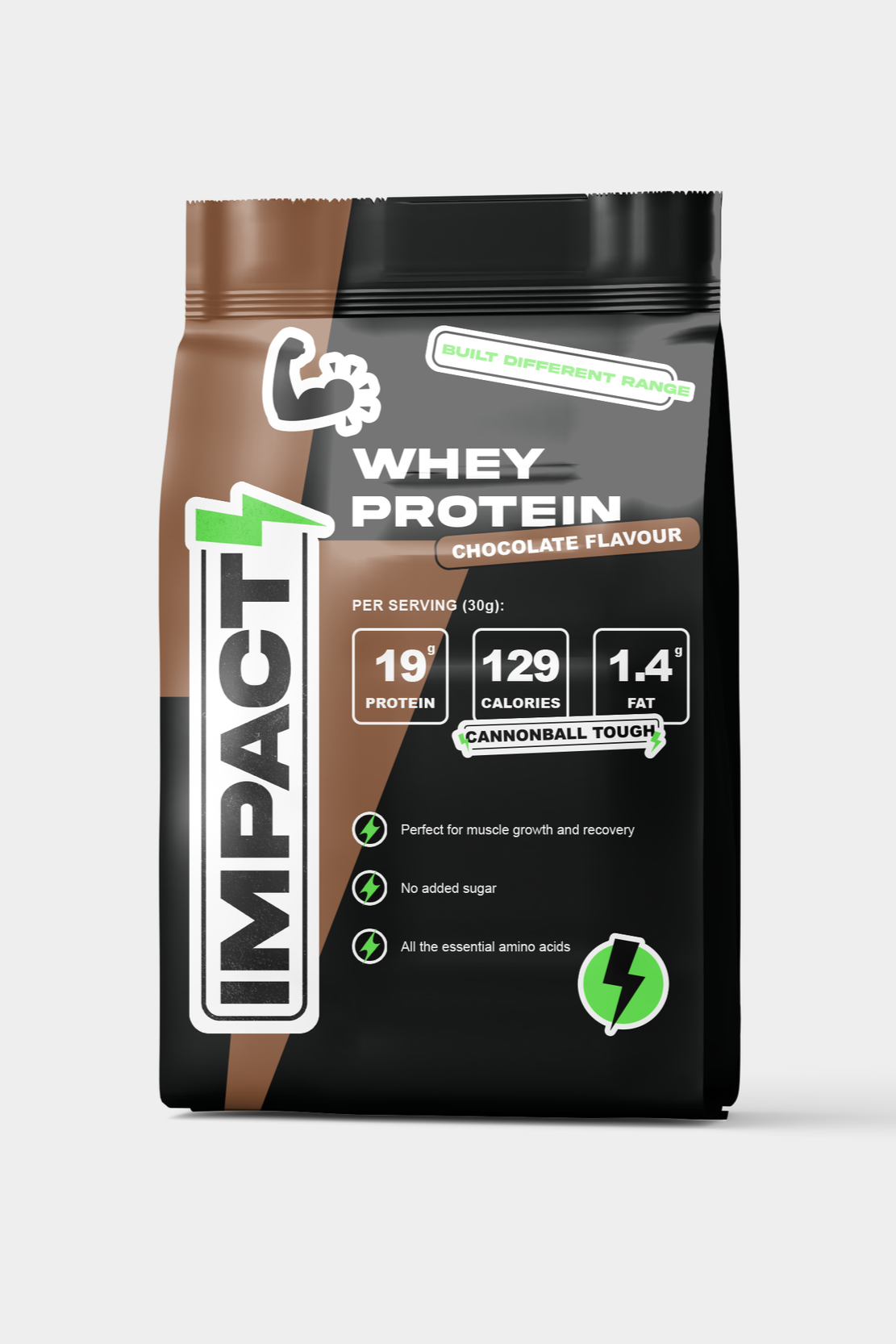
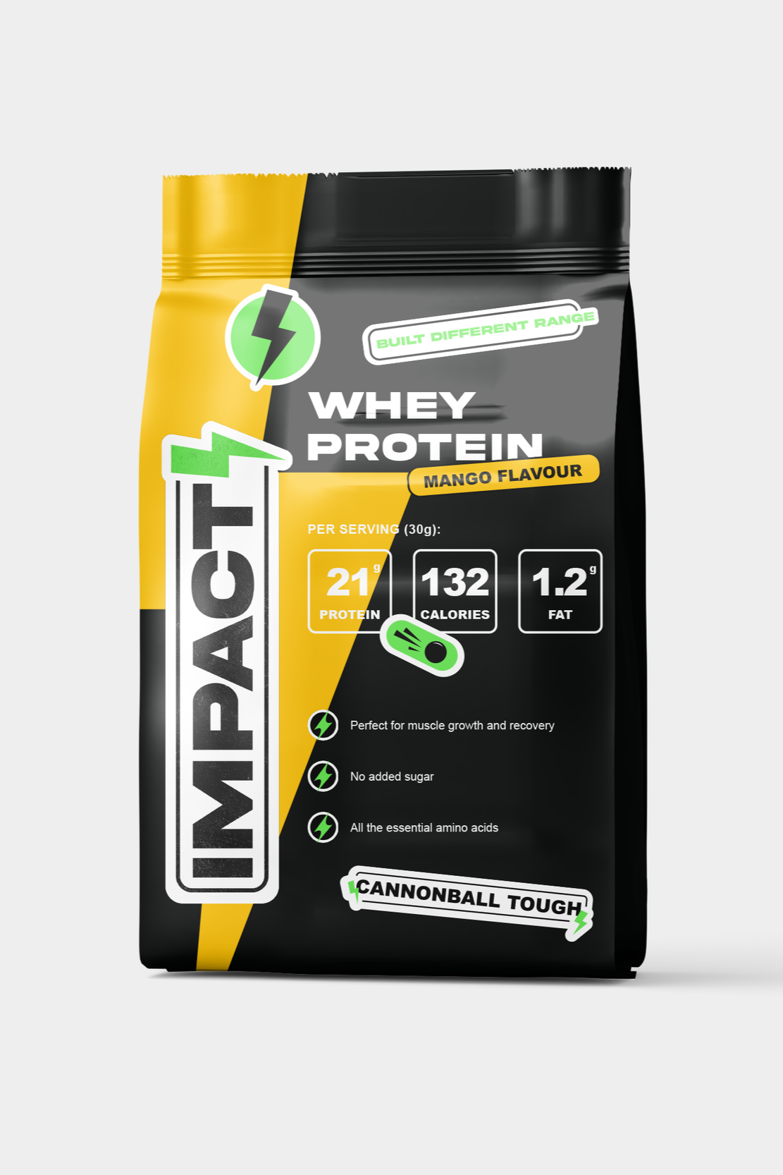
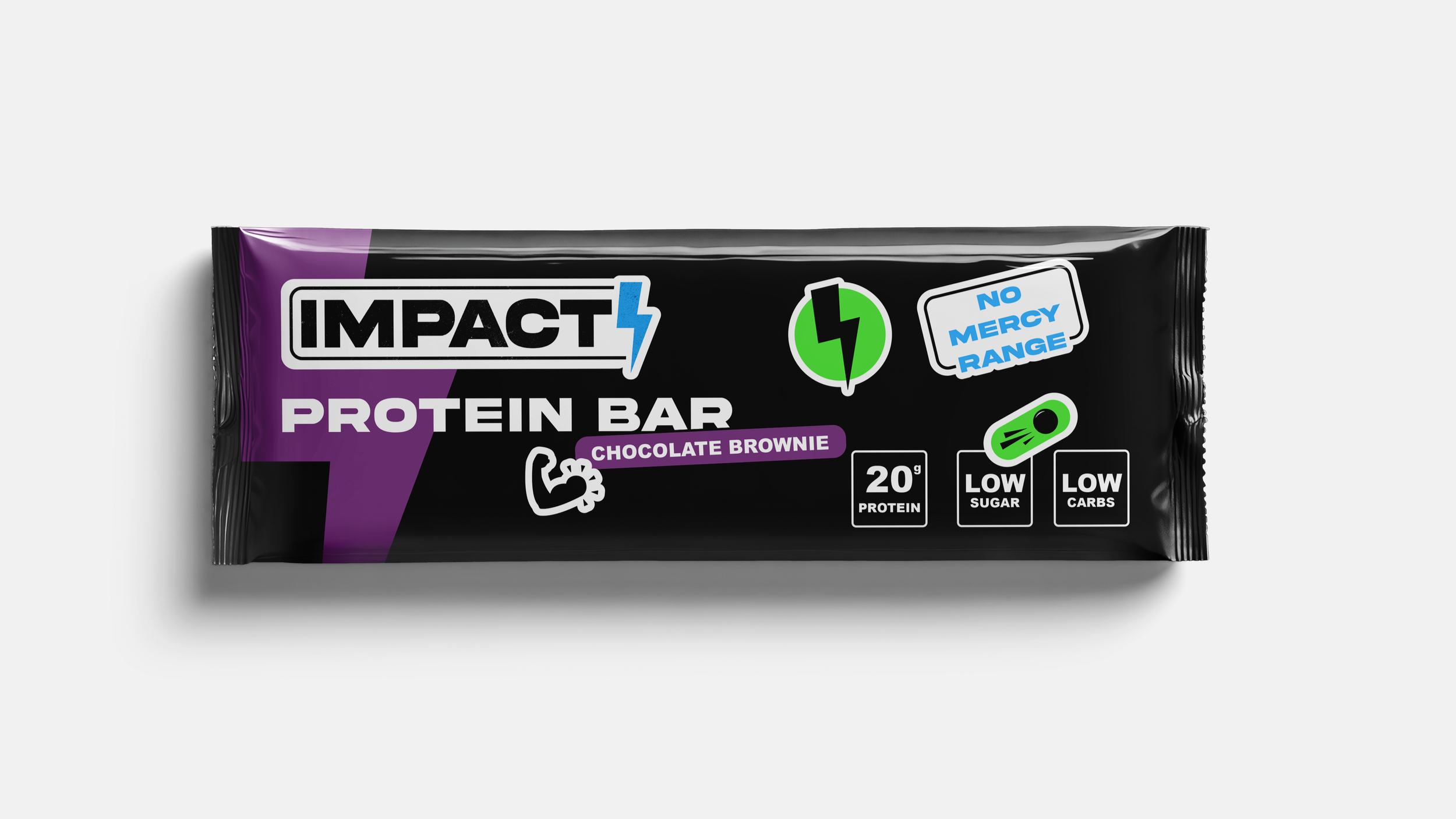
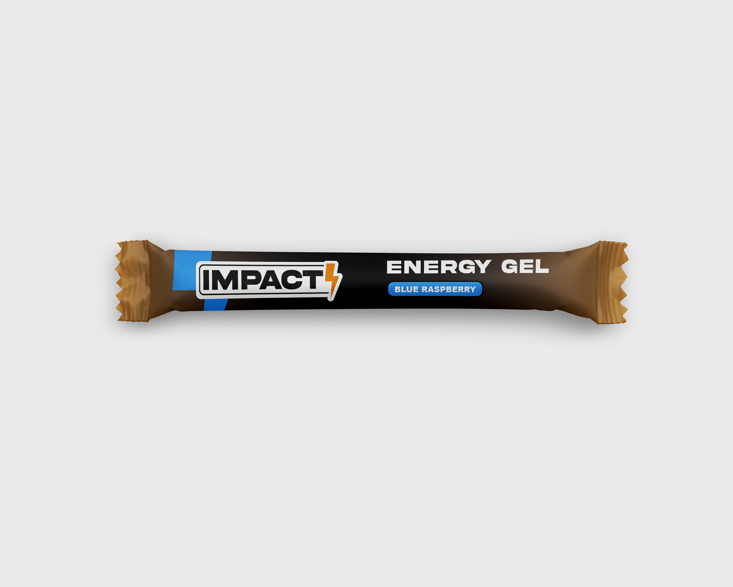
THE brand
Inspired by Frank “Cannonball” Richards, Impact is a macho sports supplement brand that takes hyper-masculinity and runs with it - in the most over-the-top way possible. The brand plays with the idea of pushing limits, but does it with a wink. It leans into gym-bro culture - the big talk, the bold visuals, the overblown energy, turning toughness into a tongue-in-cheek performance.


Target Audience
Men aged 18 to 40 who are serious about the gym and driven to reach their peak performance. They have a no-excuses attitude and focus on real, measurable results. They appreciate bold, straightforward energy and aren’t afraid to push themselves hard to get stronger, faster, and tougher.
The Ranges

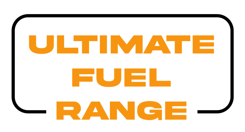
Energy Gel Range
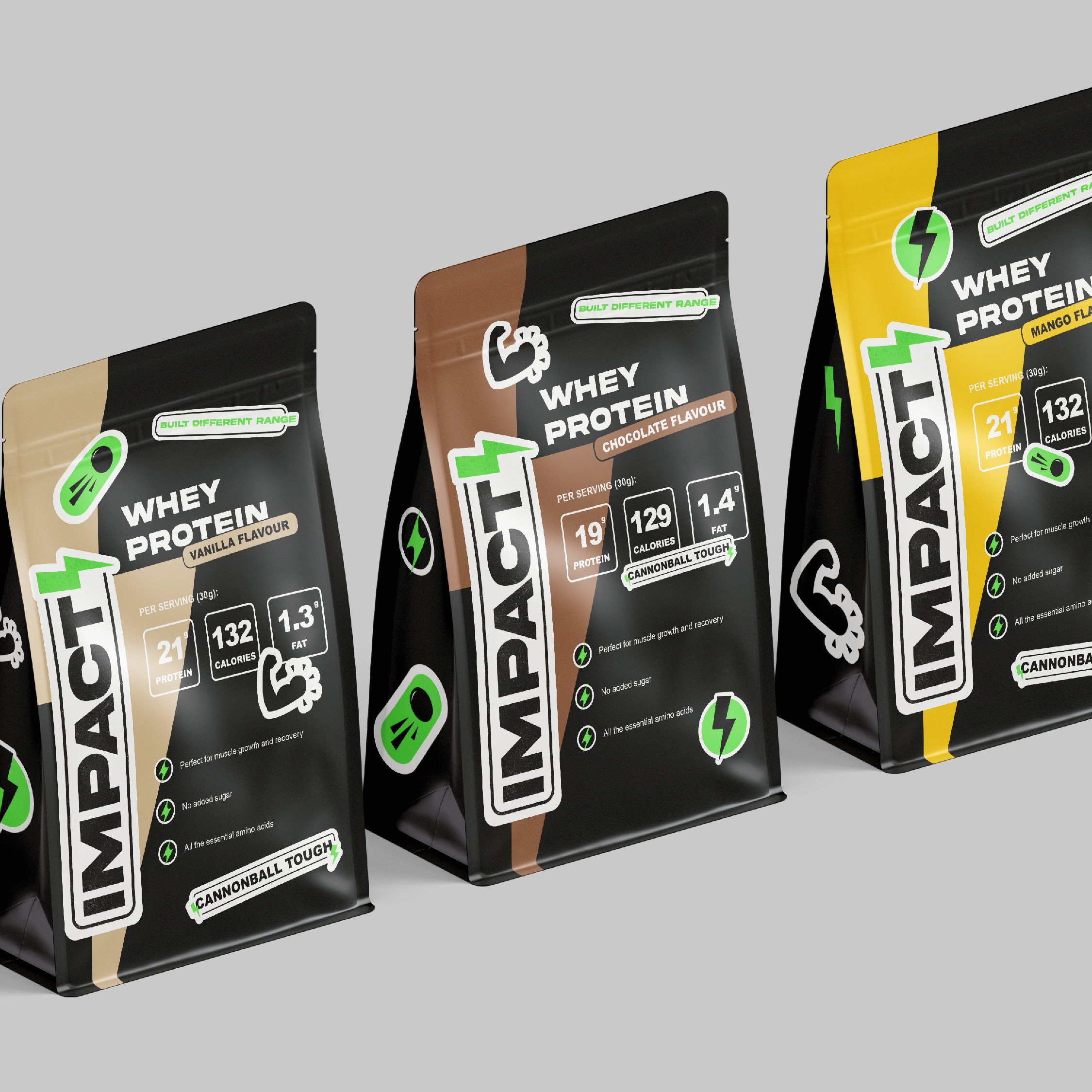

Whey Protein Range
Protein Bar Range


Designing for a male audience
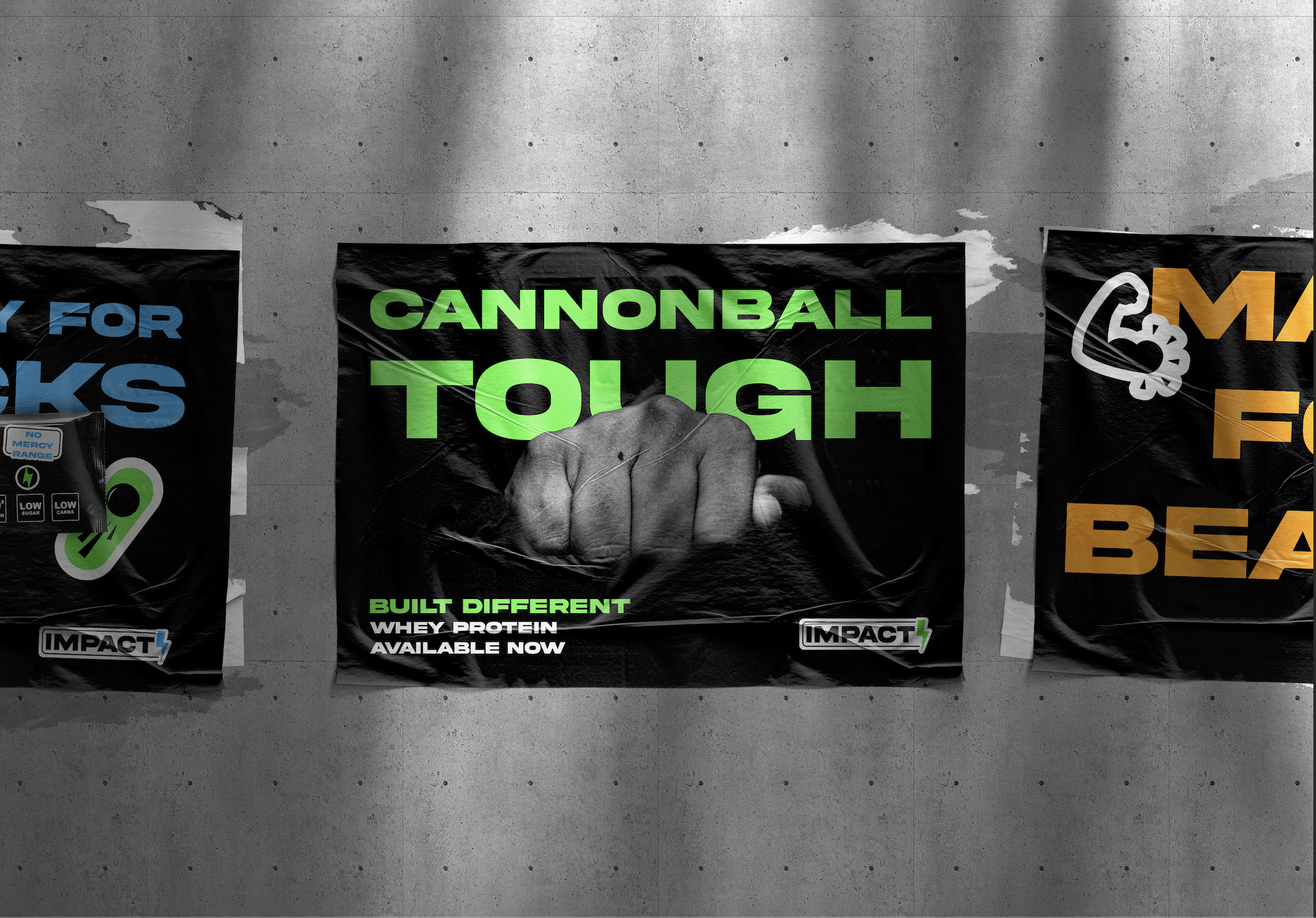
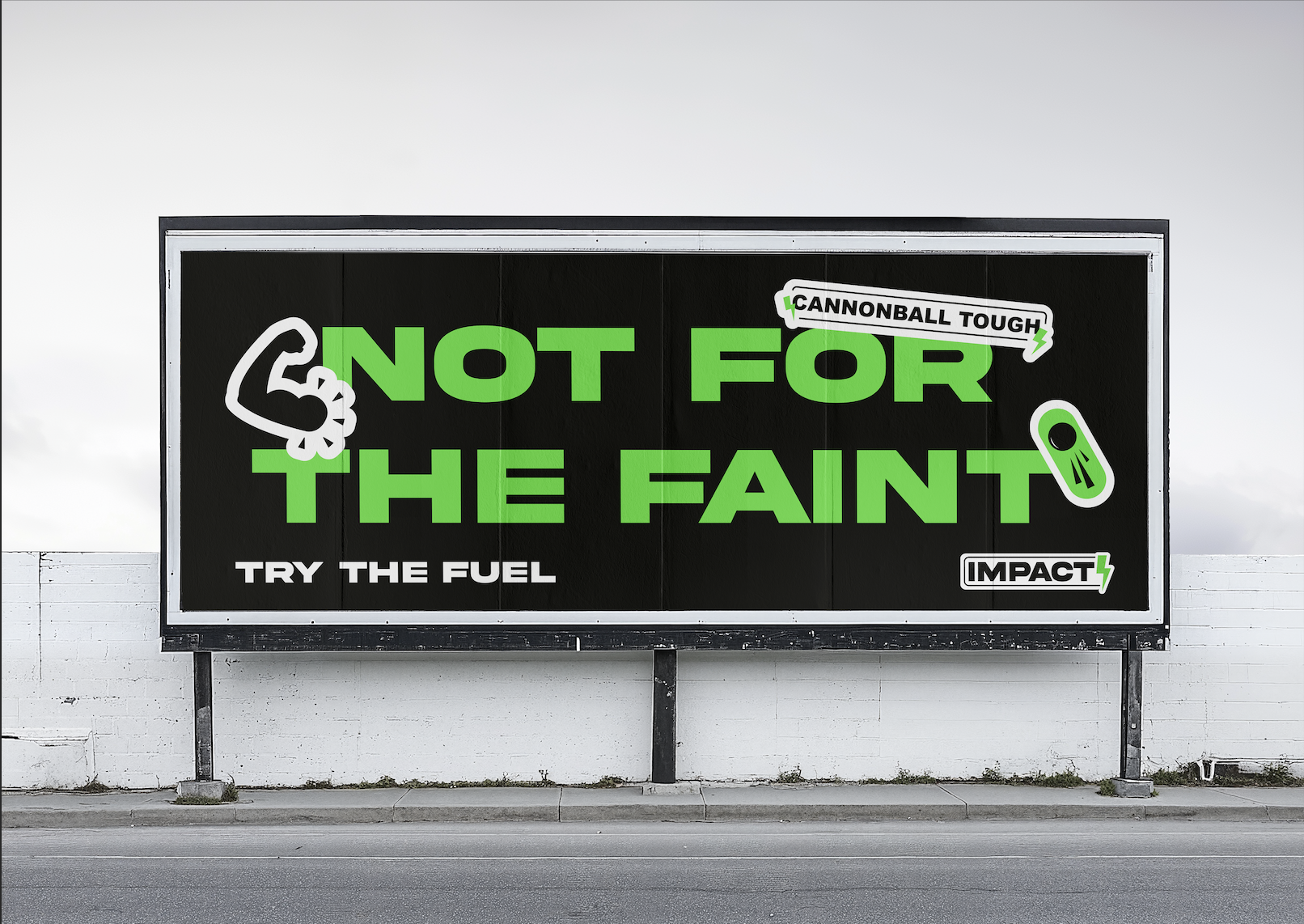
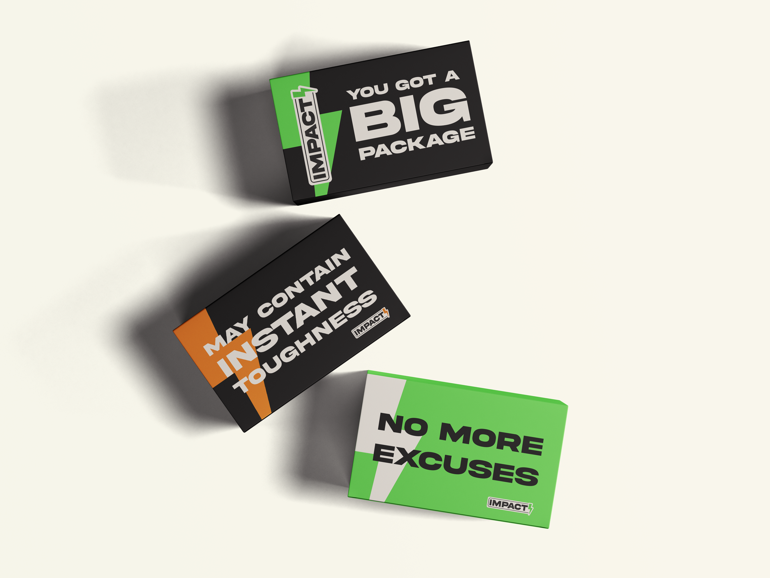
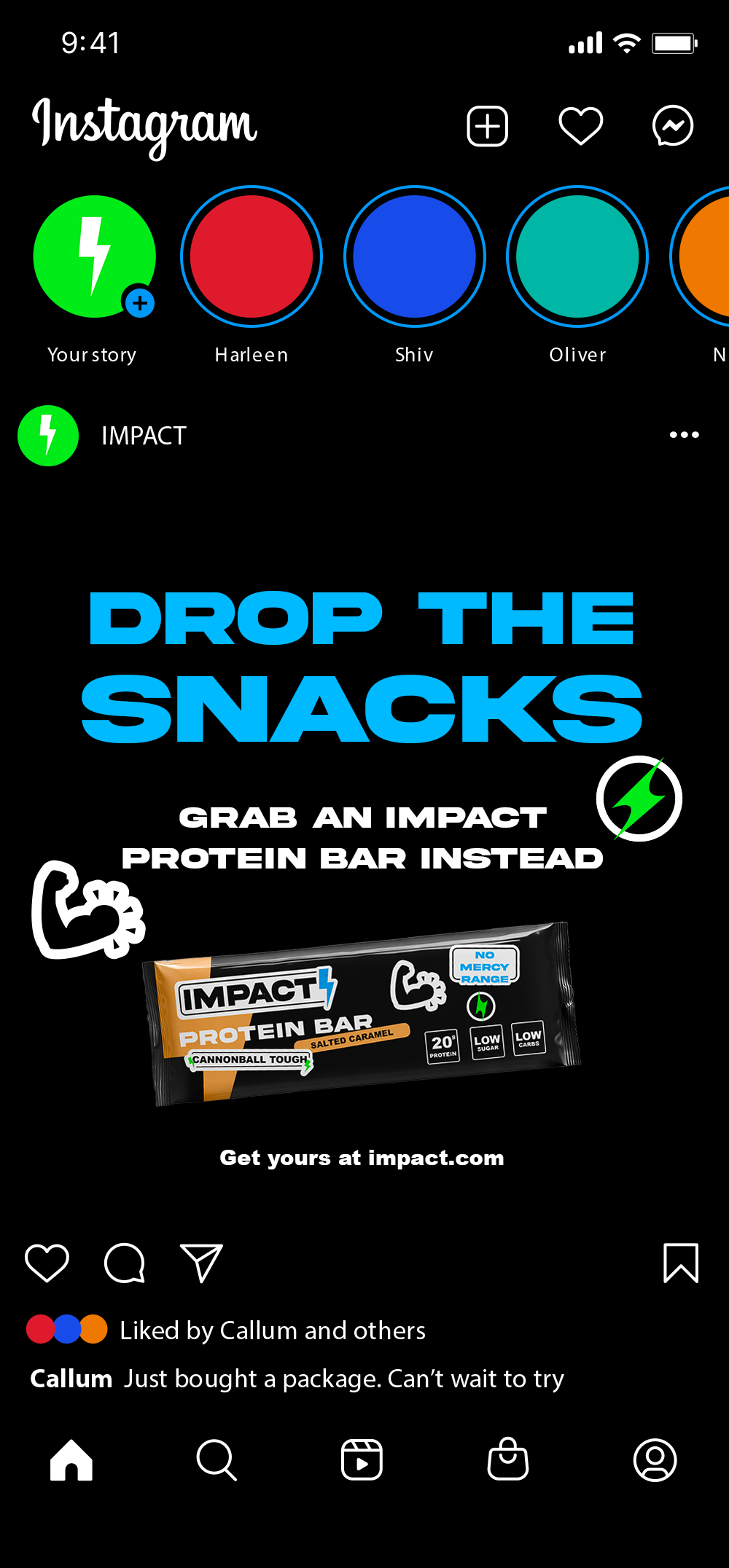
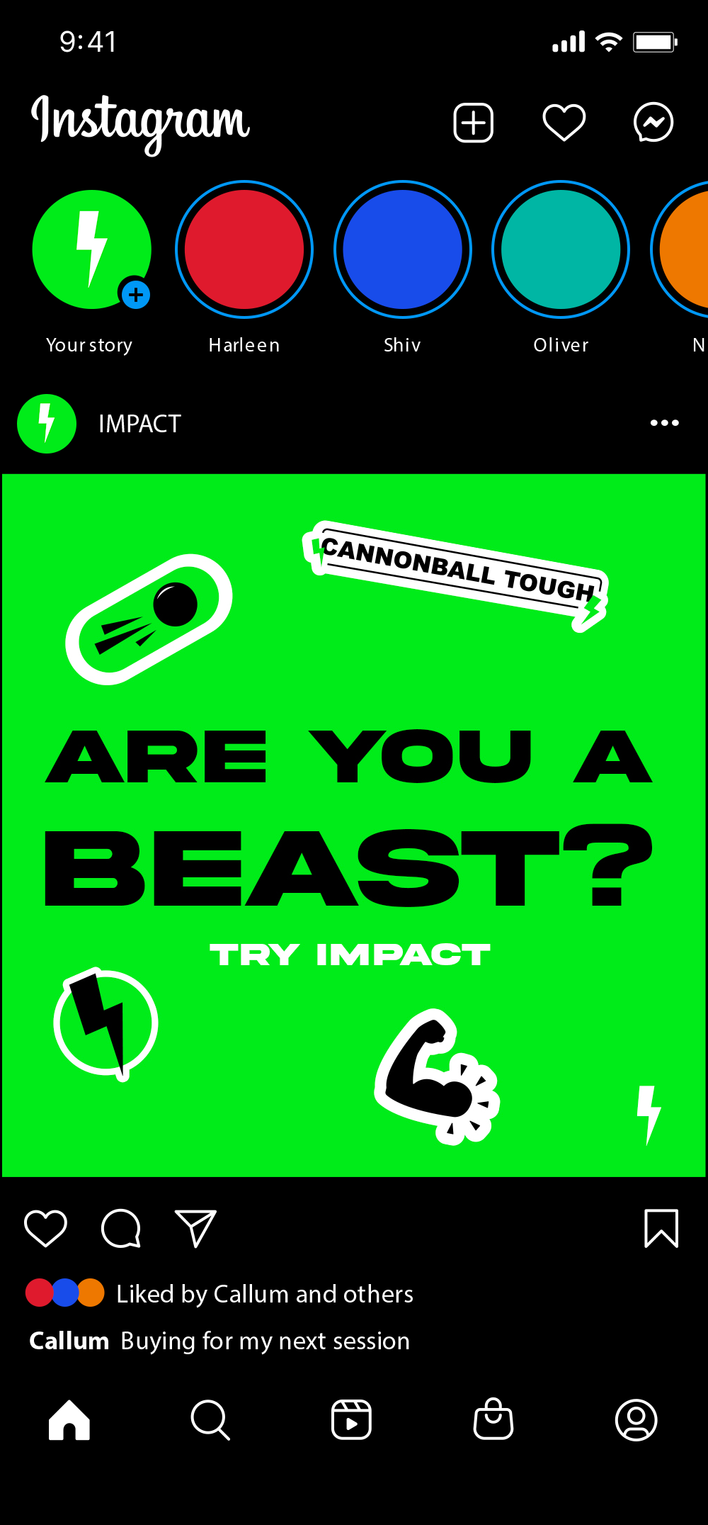
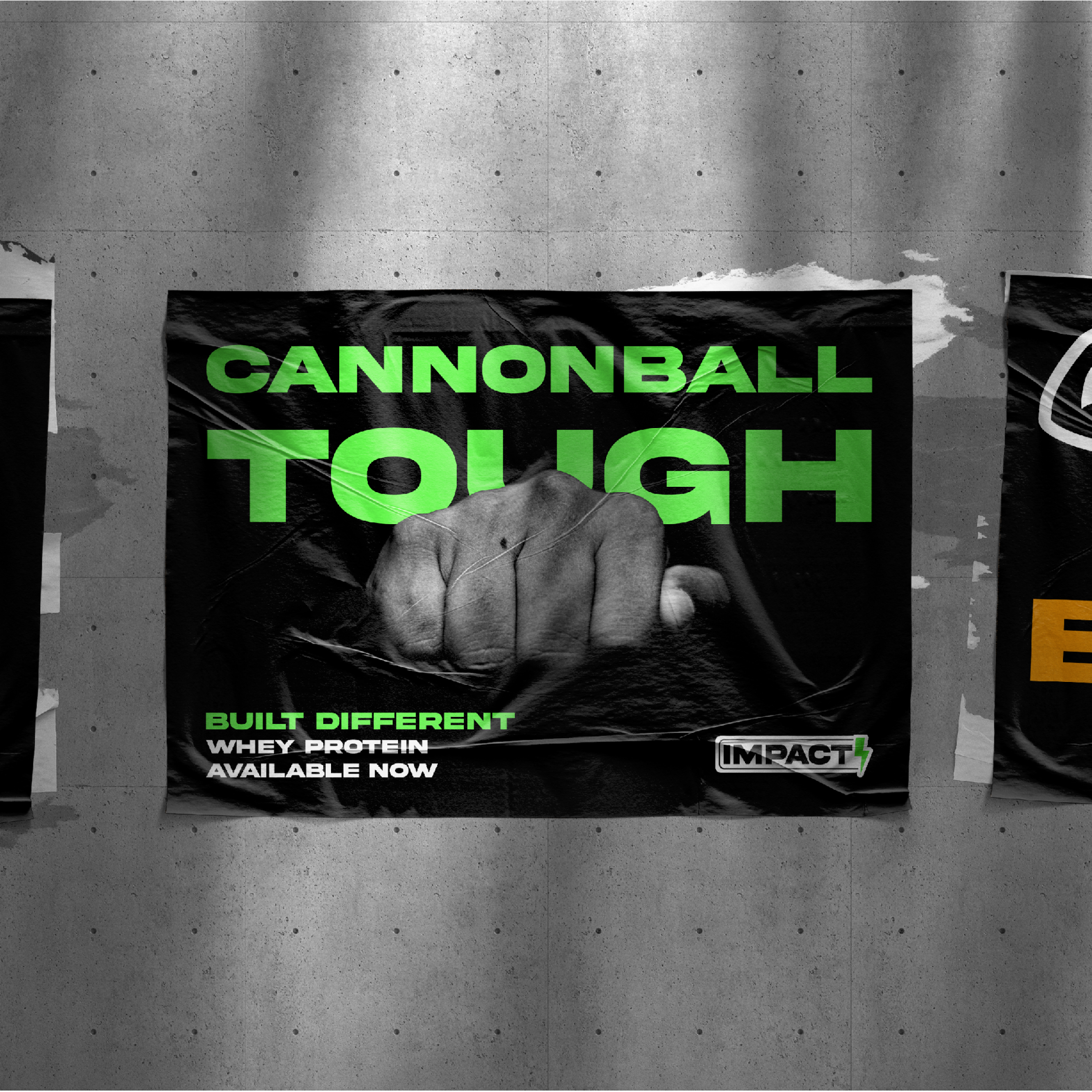
Impact is designed to communicate quickly and clearly through bold visuals, simple language, and direct messaging. Inspired by gym culture and the “gym-bro” mindset, the brand uses bright neon colours contrasted with black-and-white tones to create a strong, energetic aesthetic. This combination reflects the atmosphere of modern gyms while helping the brand feel cohesive, impactful, and relatable to its target audience.


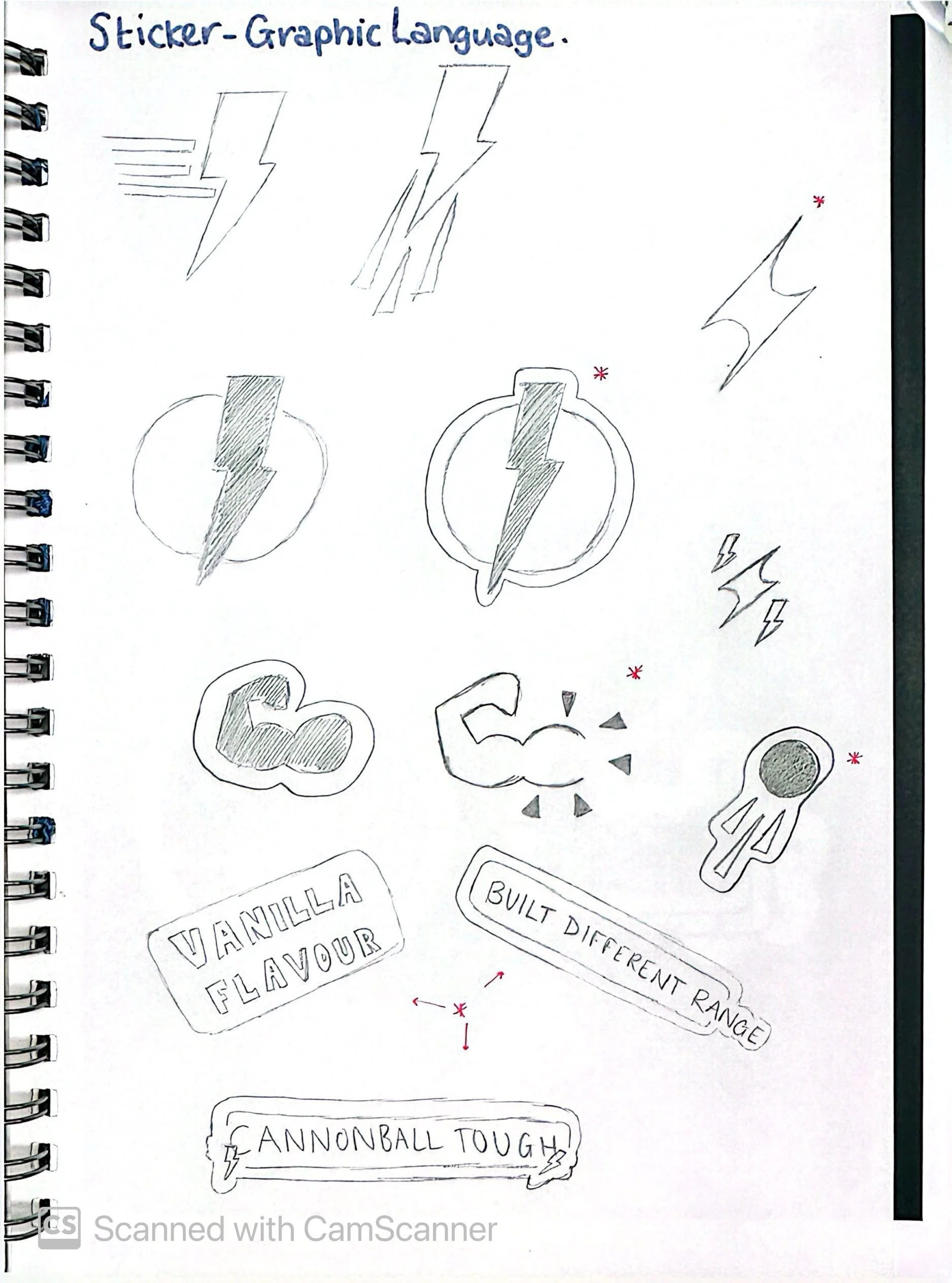
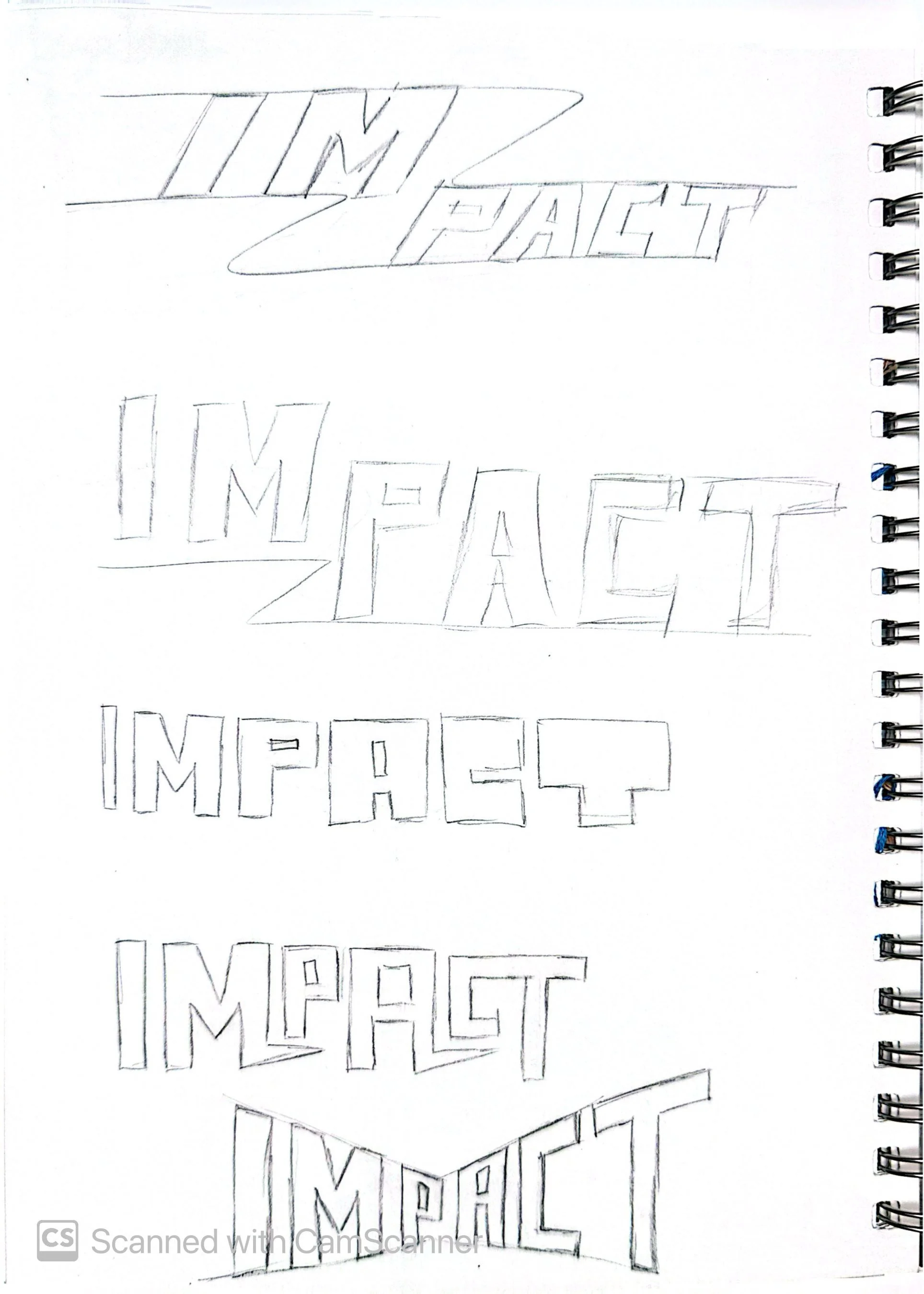
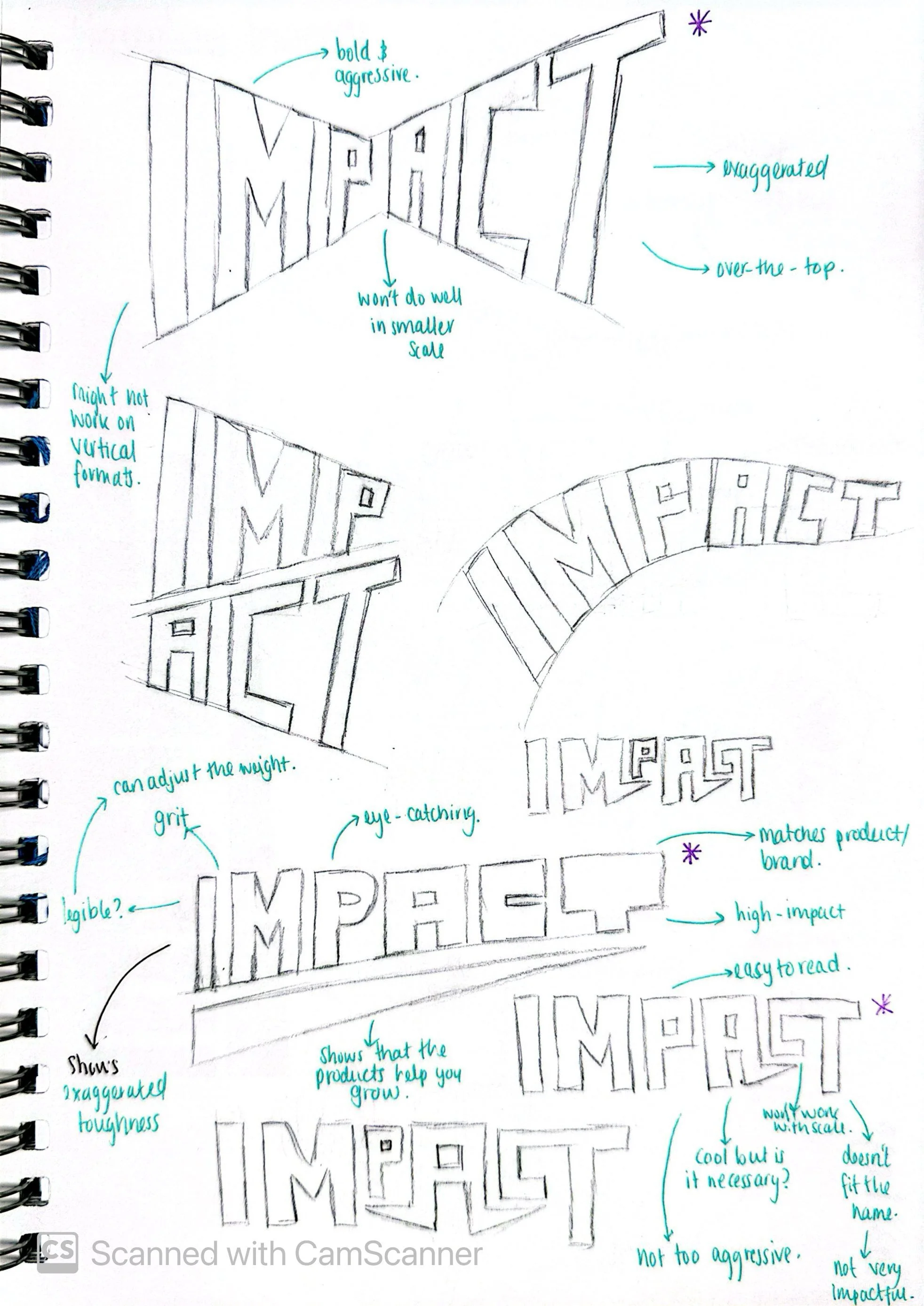
Graphic Language
Impact uses a sticker-style graphic language that feels raw and unapologetic. This rough, unfussy approach adds grit and toughness, reinforcing the brand’s no-nonsense attitude.
Real-Life Application
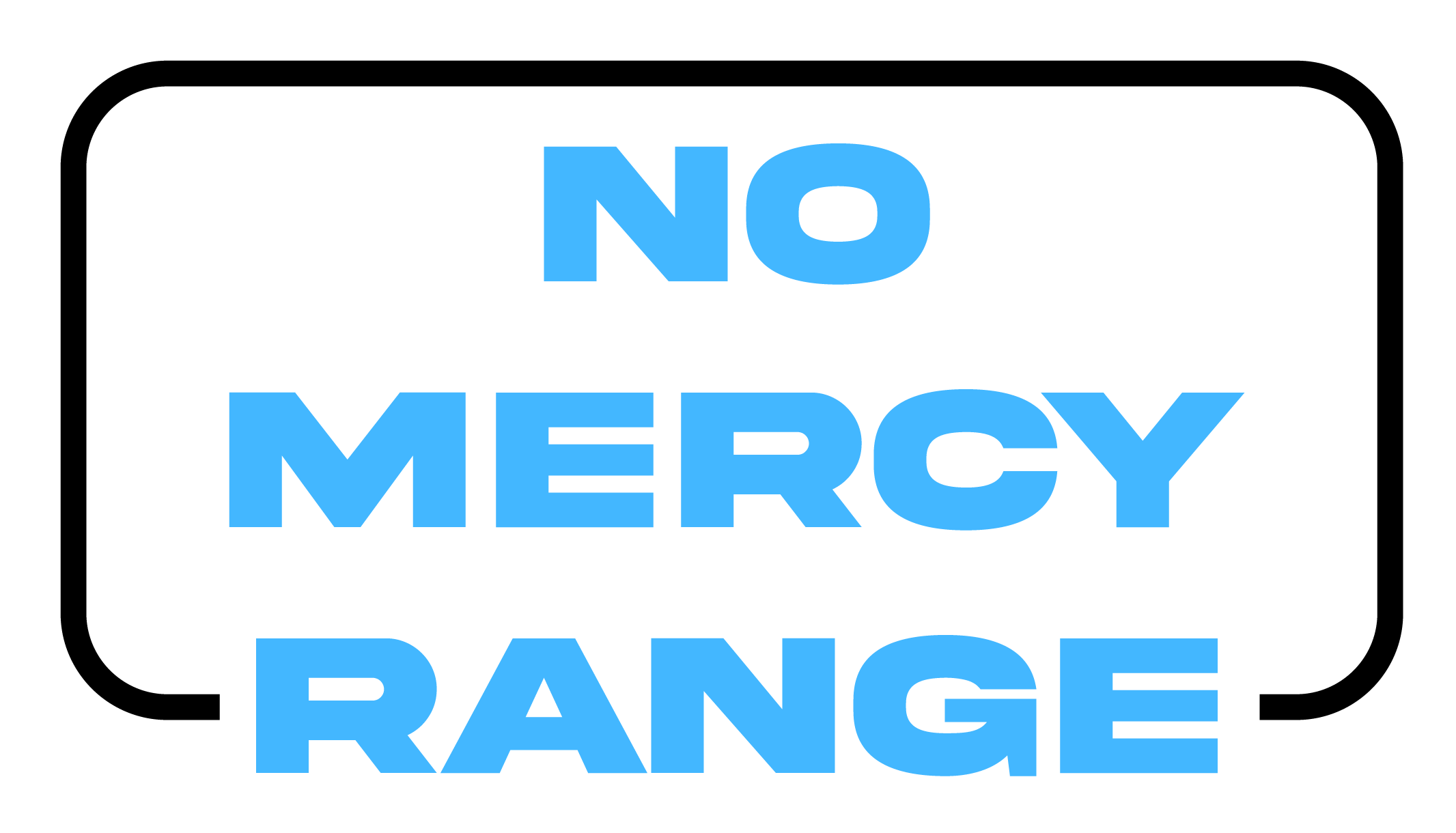
Impact uses bold, direct advertising that speaks straight to its audience, with messaging that challenges and motivates fitness enthusiasts and athletes alike. Every element- from product names like Built Different and No Mercy to the visual style across packaging, social media, and branded assets is designed for cohesiveness, ensuring the brand feels unified, recognisable, and instantly impactful across all touchpoints.